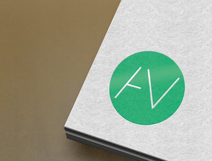
Avotus GmbH – Corporate Design
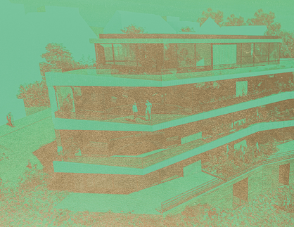
project:Corporate design / logo / key visual for a real estate developer
client:Avotus GmbH
location:Freudenstadt
Open, dynamic, and vivid
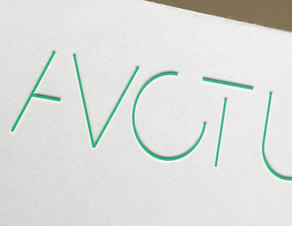
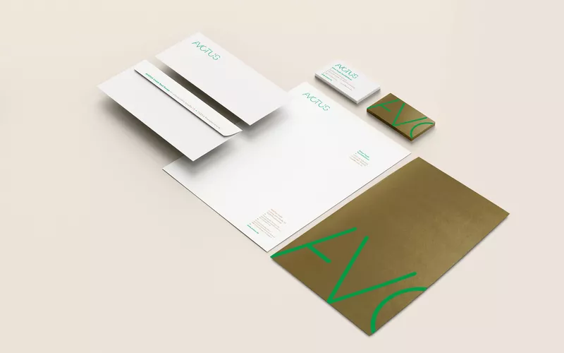
The small corporate design for real estate developer Avotus has big goals: its visual language and dynamism aim to connect with people. Organic and static forms come together and open up. They speak in a sensitive, approachable way. The bright green color scheme is intended to reinforce this feeling.
The openings symbolize »More is possible here.« The brand conveys itself in a modular and variable way. Seriousness and playfulness, company and people are combined, right from the start.
Employees were involved in the process from the outset via an anonymous questionnaire.